So I have a few banners for you all to look at tell me what you think

 Administrator
So I have a few banners for you all to look at tell me what you think
IBIS

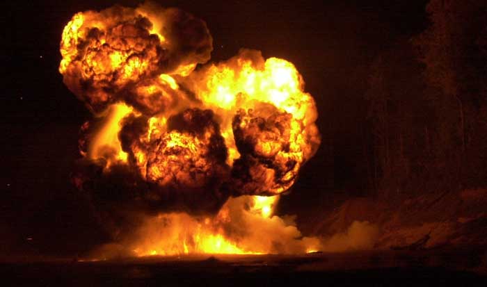
IMO, the first one is the best. A nade explosion would be nice instead of the black splatter. =P. It's very good the way it is though.
Administrator
if anyone could get a pic of a good nade blast i could see how it looks. but i will say that i like the later ones more than the first.
I think if I added some bullet holes to the background it might look really cool
IBIS Regular

I like that first one, Steamer's got a good idea. I think it would brighten up the background a bit for that banner.
All three look tight, props Zero.
IBIS
flash
I like the whole black and white look with minimal color. Always have with most everything.
IBIS

I think the First one rocks... but I play mostly Zombie Mod and it just seems to fit our whole theme!
Administrator
Remember that what I am looking for is a banner for the main website ti replace the current one.
IBIS
Yep, Remember that from the other thread.
IBIS Specialist
What you could do is find a nade explosion pic, upload it on macromedia flash cs3 or 8 w/e version you have, and trace it into a cartoonish version to fit the banner or keep it a real explosion and just edit to make it look better.
Just a suggestion.
Administrator
So here is one with some adjustments tell me what you think of the changes.
 Posting Permissions


 Register To Reply