Bingo bango.
Also here is another one that looks like crap and I know it looks like crap but I'm posting it anyway.


 IBIS G0D

Bingo bango.
Also here is another one that looks like crap and I know it looks like crap but I'm posting it anyway.
Administrator
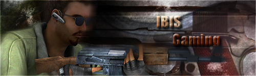
So far I like this one the best.Originally Posted by Christmas

However you may want to look for a way to blend the logo into the background more. Also I do not think the knife in the words is really adding that much...
I have attached my font folder to this post. It goes in c:/windows/
It has a lot of great fonts in it that should help.
http://www.ibisgaming.com/media/Fonts.rar
Last edited by ZERO; 07-30-2009 at 02:02 PM.
IBIS G0D
Eh?
And I will definitely download those fonts.
Administrator
When you look though the fonts you should be able to find some that really blend into the theme more
IBIS G0D
I don't exactly think the font currently in use is that bad but I'll see what I can do.
Administrator
Personally I felt that font was best suited for the cartoon looking banner. I think it blended with the background on that image very well.
IBIS G0D
Alright, since I'm so fucking horrible with fonts I'll do my best to find one that fits better.
 Posting Permissions


 Register To Reply