Another one, bit of a different style, more sleek and clean ish.


 IBIS Specialist

Another one, bit of a different style, more sleek and clean ish.
Xenn<3: if your getting old then I am old
Rob | Ibis.a: Older women are yum though.
Rob | Ibis.a: so its cool.
Xenn<3: oh dear jesus lol(ADMIN) aNex <ibis>: You are the super senior admin first class with three ranks above other admins.Originally Posted by acolyte_to_jippity

IBIS G0D
Definitely contemporary here.
I like it but, it's definitely not what we're going for.
Thats the funny thing about trolls: They love to do something horrible, then accuse you of doing something horrible when you call them on it.
IBIS G0D
 Administrator
Rob, I liked what you did with my logo it looks way way way better than mine. I did however later say that people could avoid my logo if they made there own and then used it in the banner.
So far I like the first one more because the colors make the words stand out more. The second one looks cool but you need to help bring out the text more if you want the guns dimmer like that.
Great work on the new font too this one really blends with the theme more. So far these two are in the lead. Thank you to everyone that has been working on these, keep up the great work.
IBIS G0D
I don't believe that the red and blue should be as bold as you want them to be, given they do stand out more, but they also take away from the rest of the picture.
The font needs to stand out, but it also needs to blend with the rest of the picture.
If not, what's the point of having a background?
Having the stark white, then having the flame red and bright blue, is kind of childish. Is takes away the seriousness of the picture behind it, which in this case, I REALLY, REALLY like the background picture, and I believe that toning it all down will tie the picture together, while also standing out.
the picture is well balanced, and the font is much better.
It really brings it all together.
I'm an artist, been to art college, and was in AP art all through high school...so that is my credibility.
Thats the funny thing about trolls: They love to do something horrible, then accuse you of doing something horrible when you call them on it.
IBIS G0D
IBIS Specialist
Xenn<3: if your getting old then I am old
Rob | Ibis.a: Older women are yum though.
Rob | Ibis.a: so its cool.
Xenn<3: oh dear jesus lol(ADMIN) aNex <ibis>: You are the super senior admin first class with three ranks above other admins.
Banned
Very nice Rob!
IBIS Fan

:x I personally don't think I did a good job but would like some feedback soooooo, HALP ...
Time your riddles right, and make a point that has no sense
Make sure that you're smiling, and the money's been well spent
Innocence and ignorance, it all goes hand in hand
I'm not sure that I'm right, but I hope you'll understand
I hope that you're still searching for the start that has no end
And all the plastic people have now become your friends
Before you start to drift and your soul begins to scream
I just wanted to tell you that you're listening to a dream
IBIS
I kinda like it myself.
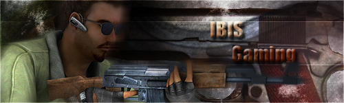
the idea of the banner is right, it screams counter-strike.
placement of the logo is good
but I would try to go with different CT characters.
-The enemy of my enemy is my friend-
 Posting Permissions


 Register To Reply